Wednesday 15 August 2012

Why the Levi's brand is so cool. (IMO)


Will you just look at this logo!?
It has everything that makes something cool for a brand - Historical placement / Craftmanship / Quality / Originality / A pair of jeans so STRONG that even a pair of dudes whipping horses outwest trying to rip them apart cannot even manage that.  Shame on those cowboys.

The logo is more US than Ralph Lauren, and in my silly opinion, the Olympic team USA should have all been dressed in Levi Denim (SURELY some science geek could have come up with a breathable denim of some sorts)

We know already that jeans are prison-clothing.  Denim was the material chosen as garb for the garbage of society in America to wear as it was relatively cheap to make and DURABLE.  Therein one single pair of jeans could last a convict almost as long as his sentence.  Depending on how naughty he had been.  The whole low-slung belt thing in American hip-hop culture is also to do with prisons and how hard a man is - so we can tell that coolness is something to do with naughtiness.  The people locked up have ultimately rioted against society - and us on the outside, work that rebellion into our fashion.


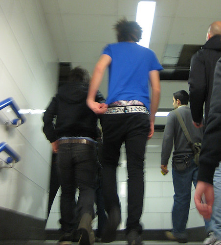
To explain the low-slung look that people in the hood wear, which then translated across to us here in the UK and teenage boys who show their boxers as being cool will be a tiny aside - as you would only be issued one belt for a stretch in prison back in the day, the longer you were inside, the more your trousers would fall down as the belt became more loose.  Therefore the lower your trousers, the longer your stretch, the badder your crime and therefore again, the more dangerous to society you were.  People who are dangerous are powerful as they are scary.  Being against society is cool.

Obviously being a murderer is not cool at all, but you might catch my overarching drift.  OF COURSE none of the teenage boys who wear their jeans low or used to, as this fashion is now out, know about the background history, and just do it because they follow the crowd.  Fashion is set by people in the know, and sometimes I think they must be having a laugh at society in general.  But fashion is all about cool isn't it anyway.

So, back to Levi's and why they are such a great brand. 


Images Levi conjures up in its brand representation for me -

-Western films (think Clint Eastwood in Lucky Seven)
-California sunshine (think Katy Perry in jean hotpants)
-Hard workers (think that dude who works at a welding joint for example, high work ethic demands high durability clothing and Levis are relied upon to provide for ALL demographics irregardless of class)
-Your grandad, or that old dude, that MALE PROTAGONIST in his no-nonsense levis.  The oldest test of time is time, and Levis have been established since BYGONES AGO - 1873 infact
-1873 - The inception of Levis - think of the historical period - the Gold Rush !  The looneys who followed the American Dream and perhaps think of Abraham Lincoln
-Blue - the colour of denim, the colour of the USA stiped flags, the colour of the ocean that America is in - think how big the country is in relation to the world - how powerful, how many people there are in it etc etc etc etc.


Branding Power is about having an audience (the consumer) who TRUST the name (the product)
As Levi's were the Original Jean, there is not much effort that it has to put in nowadays.  See the advert above - it only reinforces the Brand Image that already has been propagated throughout time.  That Pioneer spirit.  Because not many people care to know about where their Jeans come from, and mainly will buy a Label, Levi's is a trustworthy label to spend money on.  It already has cool power because of all of the cool people you have seen in films, or any other representations of culture and society.  I bet even David Cameron has a pair of Levis.

The appeal of Levis is so broad that absolutely everyone is going to have owned a pair at one stage of their life.  Anybody who rates quality will buy them and anyone who sees someone wearing them but does not necessarily care about the quality of their clothing, will buy them too because of fashion.  So the advertising campaigns of Levis obviously today include a lot of sex-appeal.  When sex-appeal is about being comfortable with yourself, everyone laps it up.  More-so than lap-dancers.  Levis have sex-appeal because the advertising campaigns also have youth appeal.  Young and Old but SO MUCH COOLER than a pair of GAP Jeans.  Gap is just not a cool brand is it.  It is too on-the-safe-side.  Too many mums buy their Jeans from Gap.  (Properly known as The Gap).  Levis have the rock n' roll appeal.  A Hells Angel will assuredly have a pair in his own wardrobe as will the next person.  You can just DO MORE in durable clothes.  You are probably doing something cool when you're wearing jeans.

Jeans are not a suit.
Suits connate work
Work is boring and establishment
Jeans are for your day off
Levis are for your day off

Therein we have analysed the BRAND OF LEVIS in a rough sketch.  There are absolutely no facts in this piece and it is full of gaping black holes.  There is no footnote or much detail on dates and people who came up with how to make jeans, or any real stuff that would flesh out the piece.  But details are not needed in branding as the overall abstract is what is being sold.  So forgive me for being not interested in showing-off pointless facts.  Branding is about Imagery.  Imagery is about Pictures.  Pictures are more important than the dates they were made, or who made them.  We all look at pictures by great artists BEFORE we check-out the date and the material used to put them in context don't we?


Monday 13 August 2012

People in Dorset are not the Same as People in London

How difficult it is to get a Big Smoke outside of the Big Smoke

As I am taking some time out of London down in Dorset, at my mothers house, I thought maybe some cigarettes would be in order.  I enjoy being by the Sea but nothing quite clears up a view of the horizon like a cloud of nicotine-infused blue smoke whiffing from my lungs to obscure that view.

Strolling to the local Tesco Express in RichTownTM (Sandbanks Road, Liliput) I knew that what was missing was a packet of my favourite Red Pall Malls.  After having been IDed from both this shop and the other local Coop shop nearby, being found without ID, and CLEARLY under the age of 18 years old, as a 25 year old the powerlessness which I felt I choose to direct into a cutting analysis of what is WRONG with the people down here in comparison to the people in London, that they don't actually believe I am not a girl just out of school on her way to collect her A-Level Results.


Because now I have to hop on my bike in order to get cigarettes, I feel my morning of relaxing has been ruined, and I am still not sure that I will be served at the next nearest shop.  I have to think about putting on make-up so I LOOK like I COULD be over 18.  Quite embarrassing.  I could have made the whole thing easier by bringing some ID with me however I don't think about this anymore as I am actually 25 years old and served everywhere I go in London Town.

1. They think that Bournemouth is a Good Night Out
B-mouth, as it is known, is a total shit hole.  Having paced myself through some teenage nights out in the only town in this part of Dorset where young people have to go out, I know this first-hand.  I once spent a school holiday working at a bar in town where the drinks were bought using a bar-code gun for example.   That was designated as 'FLASH'.  The fact that the owner of this bar was an ex-criminal who used to run the drug scene in Bournemouth and was rumoured to have once coaxed a hamster up his bum (True Story), didn't matter.  His name was Richard (Dick) something and he used to rock up at the bar in his massive black Range Rover, order 1 large glass of Pinot Grigio, intimidate the manager and then simply Fuck Off.  Driving his 4 by 4.  I once went to another bar he owned in town, which was called Sugar or some other cringey name, and saw a girl on the tubbier side of life being fingered at the bar.  At the actual bar.  So, that is how classy the night-life in B'Mouth is.


2. They build stupidly conceived pallatial mansions that should be in Orange County (Footballer city)
Because nobody in this part of Dorset (Bournemouth/Poole) ever really leaves, or reads books about History as they are mainly nouveau-riche, their idea of a great house to live in is a GIANT box, either white or beige, which has some ill-conceived Doric columns at the front door.  The front door has to be bigger than an HM prisons in order to bring-out the full effect.  All the old houses in Sandbanks have to be pulled-down and the trees ripped up in order to let-in this new brand of massive dick and upset the views of the sea for the residents who have lived here for laaaang-taam.  That is not to say that all of the houses are awful, SOME are beautiful, but I am specifically talking about the irritatingly gigantic show-offy ones.


A lot of these houses look like houses on steroids and now walking along the spit of Sandbanks gives you the feeling similar to when you just walked into a Gym full of eggheads pumping iron and sweating away their dull day jobs.  The fact that showing-off money is a contagious local game, is a problem as now these houses have germinated (the sickly opposite of pollinated) across the whole panorama of Sandbanks.  And an area of natural beauty is now beginning to look more and more like a Playmobile plastic town of massive Americanised houses.  I say houses, I mean mansions with as much architectural wisdom as caravans.  The place looks like how Malibu would feel on a hangover.  No-one moves into these houses though as they are mainly built for aaagggeess and then once they are made, just have a FOR SALE BY APPOINTMENT sign up outside because the place is run by the property companies who actually forget that families have to move into these monstrosities.

3. They don't believe I am actually 25 years old
If I ever meet my biological parents, then the first thing I would say would be, 'Could you not have tried to make me look less like a babe-faced killer?'  Until that day comes, I have to deal with baring the brunt of various shop girls and boys who genuinely want to Lord their power over me, as I don't infact, look over the legal age of 21 years old.  The better way to look at it I suppose, is that I have done an awful lot of things for a 21 year old, and should be proud of myself.  Perhaps life would be just easier, if I began to believe I was infact only 21.  But I like being 25.


So the local problem in relation to the title of this post, is Why Do I look younger to People in Dorset than People in London?  Because it is less multicultural?  Because there are more youngsters who are driven to smoking under-age in Bournemouth because of the very things noted down in this blog?  Because people in this local area are generally just more like dicks than people in London who are more open-minded to things?

I don't know.  But I had to spend £8.10 on a 20 pack of B & H Gold from the local Oddbins in order to calm down enough to write this.


Saturday 11 August 2012

Why I am obsessed with Graphic Design

I am a perfectionist with a short attention span.  I am a pathetic Fallacy because I am affected in my mood by what I see in the empirical world around us.  Just like you or anybody else.

Graphic Design at its most perfect makes sense of a messy world. 

Looking a the Nike Tick or the Adidas symbol  on a passing persons T-Shirt calms me down in a similar way to a piece of music (Adagio for Strings in G) or a fine piece of art (John Martyn Great Day of His Wrath- in particular the orange vermillion colour spot he draws you eye to in its conception)

Take Jonathan Barnbrook the font designer as an example.  He has a social conscience, having met him he is well-read, loves George Orwell and is an essentially down-to-earth bloke.  I am also interested in Social Reform although I am in the unfortunate position of being an anarchist- Therein COMPLETELY pointless except to question everything.  My view on God is the same, IF there WAS a symbol for the God of today it would be NOT a cross (as this has too much tie-in with the dogmatic formula of the corrupt churches throughout History (Although thanks to the Medicis who were both Popes and also politicians, we have had the Renaissance) Gods symbol would be a QUESTION MARK in Black against a white background square.  But essentially there is no God in my opinion today.


Being a perfectionist is difficult because everyone else tends to be slower.   They are not, it is just that I communicate badly compared to your average person so COMMUNICATION through Graphic Design is singularly my kind of interest.  It is communication in a way that is quickly understood.

However, if you can try to follow my piece I would be chilled-out.  I know I go off on tangents, which is again, backing-up why I like Graphic Design at its best.  Because it draws my attention to visual message stuff out of a chaotic place.  Graphic Design when it is NOT perfect, is also something that gets to me, but that doesn't matter especially.


So back to Barnbrook design - He has articulated the sense of chaos in everyday life in his finely executed font designs.  There is ALWAYS space BETWEEN letters (which could also be metaphorical for the NON-sense and surreal) but how you influence the exacting science of a font influences the overall feeling.  The smooth against the rough.  Barnbrook also names his fonts surreal names such as Bastard, which is my particular favorite, probably because it is called a rude word.

Barnbrook design for the Olympics logo.  Obviously.  SEE HOW incongruous it is - and FUNNY as it is surreal and serious at the same time


The surrealist painters are funny.  Because they juxtapose totally absurd things and it brings lightness to being.  Like successful comedians do also. 

But I am running away from my original point, as would be consistent with my short attention span.

Why I rate Graphic Design so much- 

Brands I rate - comparing the two competitors


Nike - 
A tick
From schooldays you remember the tick as a positive against the cross of making a mistake.
The Tick has a motion to it- perfect as Nike represents a Sports company
Just Do It - Simple, no nonsense, can apply to absolutely anything in your life, it is just STRONG in the sense of it being a VISUAL memory
It is ANONYMOUS - So in your head, ANYONE could be telling you to Just Do It - in a positive sense, so you are not afraid to do anything.

I am a perfectionist, so Nike is the most perfect logo to me.


This is the NEWEST logo.  And is a Flower- this is more succesful than the ultimate three stripe logo as it connates flowering talent or just positive life, spring, change, etc.


Adidas 
Against Nike, there is more complications.
3 Stripes against one swift stripe (The bare essential)
If we were to imagine Adidas as posited against Nike which it is in this example, ALREADY it is less than perfect.
It is harder to understand though as I look at it as a Brit.  Already there are problems in communication.  Adidas is a German company - therein I understand Nike being American better already.  The Germans work with a different language construct so perhaps this is why.
ANYTHING against a TICK is a CROSS.

Therein, unfortunately, in being the first brave bold guys, Nike have already nuked-out any competitor from a Graphic Design point of view.

So, in a brief write-up I have explained what gives me a sense of calm and peace in the form of Graphic Design.  It doesn't stop bad graphic design from being made, but at least the brands that are succesful are age-old and Nike will always, because it is SO popular and cool, be around to look at on clothing or anything else.  Nike is THAT COOL that it didn't need to be an Official Olympic sponsor.  Which almost makes it MORE publicity clever than the other brands as it is again seperated-out.

Not very funny stuff so I apologise, but sometime it's cool to explain serious stuff and the reasons why stuff means stuff.


Thursday 9 August 2012

My Id is an Idiot


I am a surreal dater.  A Serial dater, not cereal dater - I don't have dates every morning as part of my breakfast.

I just find myself alone on multiple occasions when really I should be 'going-out' with someone as everybody else seems to be.

And I technically AM going out with someone, a nice boy who told me he liked me.  And I suspended disbelief for long enough to convey that some meaning.  Perhaps he does.  However, the sticking point for myself is that, BECAUSE I always like 'interesting people', they tend to have unusual habits when it comes to dating.

I shall qualify a few examples from my past dating history to illucidate -


1. Poet Boy
A nice boy.  Though age is a problem, as he is a year YOUNGER than I am, therein I constantly throw-up (not literally more il-literally) scenarios whereby his age must be a problem.  However, Poet boy does bust out a very good type of writing.  So much so that he can do poetry as a job, if that was a term.  He is so successful at it that he is going to even be on telly pronouncing his denouncements so he must have more than an ounce of sense beneath his creativity.

Poet boy is so busy, that he can't see me until some very far-off date of the month.  Therein, I lose interest as the alternative is to sit on my clasped hands slowly waiting for him to become available.

Clearly, Poet boy is NOT available.  To no avail he is in-fact.  As Poet boy loves poems more than girls in rapture of his talents.


2. Artist Man
A regular staple to my romantic life, Artist man texts me often and I text him in a game of tortured-artistic tennis.  Artist man has Attention Deficit Disorder so also works as a Drum n Bass DJ.  Therein whilst he simultaneously paints large-scale paintings for upcoming B-movies or something else.  Artist man has been bought by Saatchi and his graffiti is also another past-time.

The difficulty with artist man is his essentially errant soul.  To be able to hold attention for a fully-grown man with the self-sufficient means made from his art to allow him to follow whichever whim or fancy suits him on a particular day, is TESTING.  Artist man seems to have had a change of heart as of late however, as he is buying up a flat and thereby will desist from camping-out in his art studio.  No, he really did have to bath in a paddling pool as the studios had no washing facilities.  You see, it is his ardant imagination that I fell for.  Where other people may have thrown their hat in and walked away from the chance to live out their adult life having to live on a mattress thrown ontop of a ladder (thereby an indoor tree house), Artist man inspired me to another way of thinking.  Artist man is also nearly twice my age.  A thing that I am not necessarily reassured by.

3. Accountant man
 I am often told by friends in the know, who know me well, that I am best seeking-out the less interesting type of fellow.  The accountants, for example.  Well I have had a run-in with someone who seeks the answers to their soul through analysis of spreadsheets however it did not go as easily according to plan as you would think from a boring person.

No, the thing that attracted me to Boring Accountant, apart from his reliability, was his actual state of flux- the torture that beset him that he had no interest in Accountancy or Numeracy at a base level.  No, he did not enjoy making and collating forecasts for upcoming finances and he was about to STOP that altogether to become a Doctor.  Ah - the Jesus complex!  This is more like it.  He had martyred himself for a neat financial packet and now was ready to do what ultimately he always wanted to do however had been too enfeebled by schooling of capitalist thought.

Accountant man was now a Man among beasts, raised higher in my esteem for his disdain for Numeracy and Financial stability.  So in effect, it was a brief affair with sensible men that I experienced.  Soon enough, Accountant man lost interest in me, as I have a very irritating habit of not reading a newspaper from beginning to end, but like to dip in and out of the bits that interest me instead.  That, along with my impartiality for shaving my legs, in effect ruined my chances with Accountant-Doctor man.


So, a third of the way through, and already I see disparities with myself and my fellow more successful girlfriends who are in relationships.  The same can be said for my boy mates who are in relationships.  Perhaps there are less of them though as this is a difficult age to qualify what you want in a partner.

I think I have just worked-out what I don't want, and need to maintain a patient level of disdain juxtaposed with hope (paradox) until somebody unfortunate enough, comes along.  Although it does seem less and less likely with the passing of time.

Although I don't think I will ever buy a cat, so at least that stereotype is off the cards.  Cats do annoy me with their cuteness.  The cool ones are fine, but essentially they are limited to being animals and you can't legally marry them, or have children with them.


Monday 6 August 2012

The difficulties of being an artist and how i see things explained

I have a problem with being an artist but I have a problem with being anything else.

When I look at other artists, I have the same disparaging view as I get from what I know when they say, 'I am an artist'.  Mainly because I studied so many artists at University and worked at more than a few Galleries after studying Fine Art in the same establishments that they went to instead of to LEARN THE THEORY FROM OTHER ARTISTS so I know a little more about what being an artist MEANS.

I am anti-establishment and daily have the same restlessness that other artists in time have had.  This unsettling unhappiness with the way that other people cannot see the world or daily life in the same eyes as I can is something that I struggle with my patience for.  I am interested in graphic design and advertising but could not happily work for someone else in an office as I have tried this before and it is just a waste of spurted energy as I come across so many people living life in THEIR way which is so diamettrically opposite to how I live MY LIFE.  I question myself in the role of an artist every second of everyday.  It is not a pleasant feeling because as an artist, you are outside of the box and it is a LONELY affair.  And the loneliness only gets worse the more you stay in the real world of other people than if you were to resign yourself to the way you are as an artist and try to settle that inner innate question of changing how people SEE THINGS.  THAT is the only thing that could settle my inner turmoil.  And it IS an inner turmoil.  SIMPLY BECAUSE it is so out of the box.

Even now I question why to be an artist instead of some guy in advertising or a graphic designer.  But to me, the art of a graphic designer is very much about the similiar way of getting peoples attention to change the way they look at things, it's just that you have to be GOOD at doing a job.  And you have to therefore be in the same system which as an artist you are outside of - the commercial sector.  Or the corporate sector.  To be a convincing artist, the problem of even charging for your work is a GREAT ONE.

Because you are questioning all of the time, the work you make is a response to the inner question, and THAT THEREFORE BECAUSE it is art you are making, why put any price on it at all?  You have to put a grandiose price upon it as that is funny and a laugh at the whole establishment that you don't believe in. (The capitalist one) SO the only way to MAKE MORE of your social response to in the form of art, IS TO SELL your work in the first instance.  As THEN you can make MORE stuff which is therefore using more expensive materials which therefore captures the imagination of the buyer more as it is more expensive in PROCESS.


BUT THE PROCESS OF MAKING ART IS THE EXACT SAME WHETHER YOU USE THE FINEST MATERIAL OR THE LOWEST BUDGET MATERIAL EVER.  As they say, a toolsman blames his tools.  When your tools are fabulously good (And looking at my drawings I know this to be true) then it is inconsequential what tools you use EXCEPT FOR them you being a slave to the establishment that buys your work in order for you to make more.  And if you MAKE MORE work and it IS MORE FREEING TO BE ABLE TO MAKE BIG MASSIVE WORK as then your work gets seen by more and it MEANS MORE as it is closer to CHANGING PEOPLES PERCEPTION OF HOW THEY SEE, then it is WORTH putting a price on it.  The art market has ALWAYS revolved around the normal economic market as it is quite unquantifiable.  Having knowledge of this myself as I have worked at galleries.

SO, THIS is the way I see things, and it is singular to me.  And my art has changed in its conception as my views on the world have changed, and what unsettles me has changed as I question more and more what I see as people living out fairly boring existances.  Therein the artistic quest is more needed to be heard, and therein I am yet more troubled as I sound YET MORE mental as I think in an 'Out-there' kind of way, and it would make everyones lives easier (my parents especially) if I just got a job and didn't follow this silly thing about art.  But it has always been my only interest and the only cure for my restless nature.  That is the way that I am wired.  I cannot help the way that I am wired but I CAN help myself by just going with it.  Even though one is up against a LOT of shit as an artist (And fellow artists that produce poor examples of art being on fine example.  I do not want to be within the same defined brackets as MEDIOCRE artists.  And I have AVOIDED that by avoiding being caught-up in the shit quagmire that so-called artists are up in at the moment)


Here is a formula for how I see things - 

Colour - you see first (As you feel it)
Form - you see second as you SEE it in the empirical world around you
EQUALS (an infinite thing so You can go back on the equation at any time and put it in any way at all and it still is there making sense)
Light - what you see (My formula is qualifying SEEING itself)

So, as a formula it is (C + F = L)2

But within that, F - for Form, already has a formula.  So you would insert the formula for F within those brackets if you wanted to, in order to describe more detail)

C = colour (That initial thing you see even when you close your eyes (Thought)  Automatic writing could connate te same.  But essenatilly it is the REASON WHY purple the colour is known as the third-eye in spiritually engaged people)

L = light, = vision (The whole thing about vision is it comes as one (infinity) with colour and form)


But I need structure in order to communicate this formula ~ A PICTURE.  The ONLY WAY to DESCRIBE seeing things in this way is to draw/paint it.  It doesn't need to effect social change, it is just a dialogue with other art works that have influenced me over time and what I actually believe in.

Vision is inifinite.

A thought -

If you were to think in an abstract way, therefore not paying attention to detail, then you need the structure of a grid in order to make a flying thought rational,  As people we need rational and read newspapers that are all according to a grid.  (The bare format of a newspaper, or of graphic design)

Therefore, abstract thought only makes sense in a readable way when positied with rational grid, (linerar thought) nonetheless it makes sense anyway as it is metaphysics (philosphy in its essential form).

This is a mixture of an old piece I wrote when I was fixated on metaphysics.  But you need to think about how and why and what which IS physics, in order to see the space in life.  The space in life that the Cubists pointed out or the space in life today which font-designers point out.  The reasons as to WHY the arial font is more readable to you, the reasons for THE EFFECT that a font has on HOW YOU READ SOMETHING.  How we can be affected by the space of feeling in life all around us on a daily basis if only we looked at things more.


HERE IS MY MANIFESTO I used for a recent show.  It should explain the tenets of my own theory. 


Yes, finally breaking through into a new type of deconstruction.

Quite glad to have arrived at this point. The gaps between the letters typed into a facebook message for example. My 'show' will only be hoping loads of other people can just use my old stuff for whatever they want to, wipe their nose on it, write a poem over it, step on it. All of that kind of stuff. Not a performance piece. Originality is banality to a certain extent.

All about things not going according to plan. Just a bunch of paper. And a bunch of people. Trying to get that FIGURATIVE space to make the essential marks. If a mark is even needed. Fuck whatever else according to whatever else themes.

It's about not owning anything you make. It's not why I made things, like drawings. Drawings are copying. Essentially. Drawing past that, is the more interesting thing. That ledge between ledgibe and unledgible. That part that makes everyone feel a bit disturbed, the [out=there] ness.

That makes sense to me. So empirical stuff is just not challenging enough these days.

Phew, that was a big message wasn't it. But it is helpful to me to think through what might happen, or might not happen. That bit BEFORE thought - THAT is WHAT i am interested in. What even IS THAT?!

ha.


Hahahahahahahahahahahahahahahahahahahahahahahahahaha